01

"Inspiration Studio"

"Inspiration Studio"

"Inspiration Studio"

"Inspiration Studio"

Case Study

Case Study

Immersive Landing Page Design

Designed to connect the higher-end digital customer with luxury appliances as seen in a physical showroom experience.

A desktop and mobile sized landing screen each displaying "Find your Inspiration"

The Brief

The Brief

Abt has been a brick-and-mortar first company for many years. The store has a reputation in the Chicago area for being an experience in and of itself. This project seeks to bring more of the in store experience online.

The Process

The Process

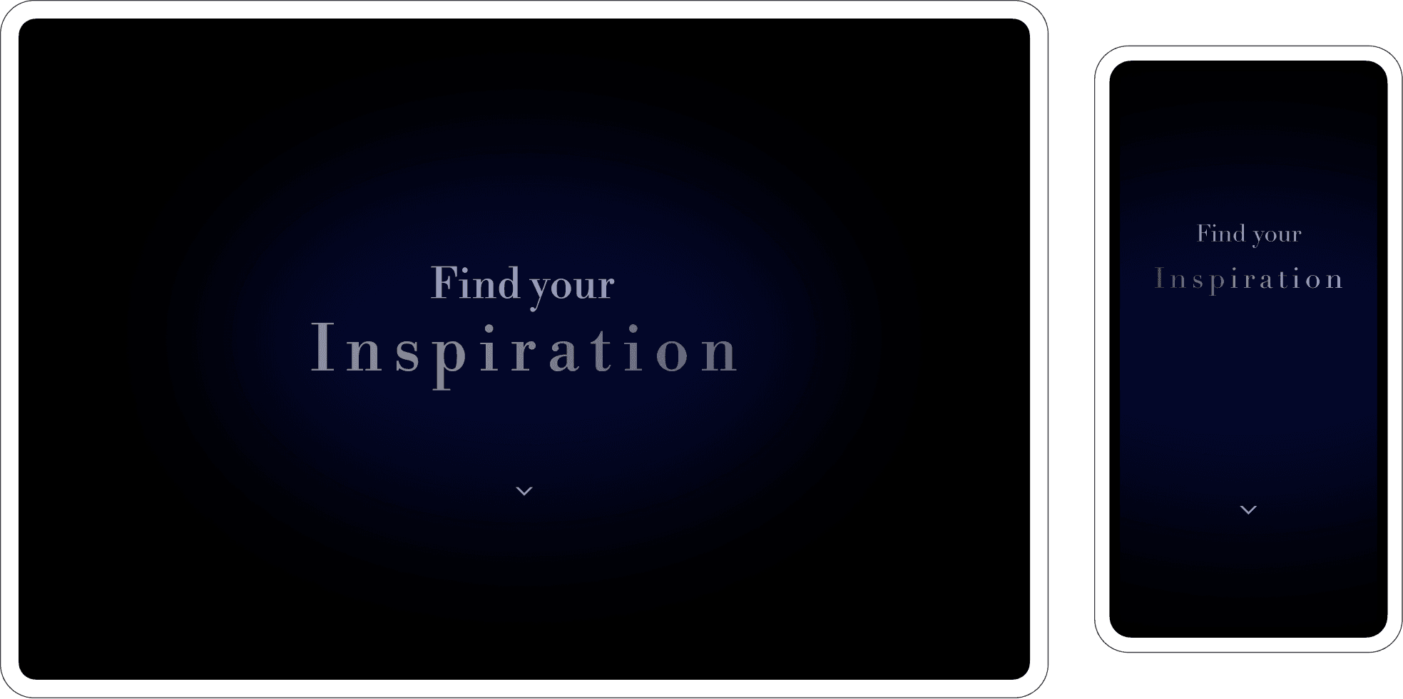
Research and Inspiration

Most of the efforts to bring the in-store experience online have been very literal—such as a streetview-style walkthrough of the store. The result is hard to keep up to date and not very useful to an online shopper.

Most of the efforts to bring the in-store experience online have been very literal—such as a streetview-style walkthrough of the store. The result is hard to keep up to date and not very useful to an online shopper.

I was looking for ways to make a visual impact that connected more directly to the shopping experience and turned to luxury car makers and high-end furniture sellers for inspiration.

Inspiration also came from one of our developers who had created a product-pinning feature some time earlier which was never implemented

Visual Design Choices

In order to communicate high-end luxury and experience I looked to depart from the standard look and feel of the site.

The changes would include:

  • More generous use of whitespace

  • Didone display fonts

  • Animated page elements

  • Larger, more immersive imagery

Visual Design Choices

In order to communicate high-end luxury and experience I looked to depart from the standard look and feel of the site.

The changes would include:

  • More generous use of whitespace

  • Didone display fonts

  • Animated page elements

  • Larger, more immersive imagery

Version 1

The result is a page that aspires to spark the imagination of those who view it. Instead of a traditional shopping experience that features primarily product vignettes and an abundance of data, the inspiration studio page puts appliances in-situ allowing shoppers a more visually complete understanding of the product.

Challenges

This project encountered a number of challenges and constraints which significantly impacted the outcomes.

Not having a photographer at the time, we relied on existing imagery from the show room floor. Some of the images were not high enough quality to use on the site. Since then, our marketing team has found a freelancer and is planning updates to the imagery.

Additionally, we were breaking new visual ground for abt.com, our team relied heavily on the prototypes to sell the concept to upper management who were receptive to the concept once they could see it.

Next Steps

While this project did achieve much of what it set out to do conceptually, there is still room for it to grow both in craft and execution and in business-related outcomes.


My next steps for this project would involve refining the visual design and working with marketing to tailor the experience more fully to it's intended audience.

Results

Results

CUSTOMERS

300

IMPRESSIONS

2500

SALES

2500

STATISTIC

75

In Conclusion

At the heart of this project lies the philosophy that less is more. The design revolves around a clean and unembellished aesthetic, utilizing a restrained color palette, generous white space, and simple typography.